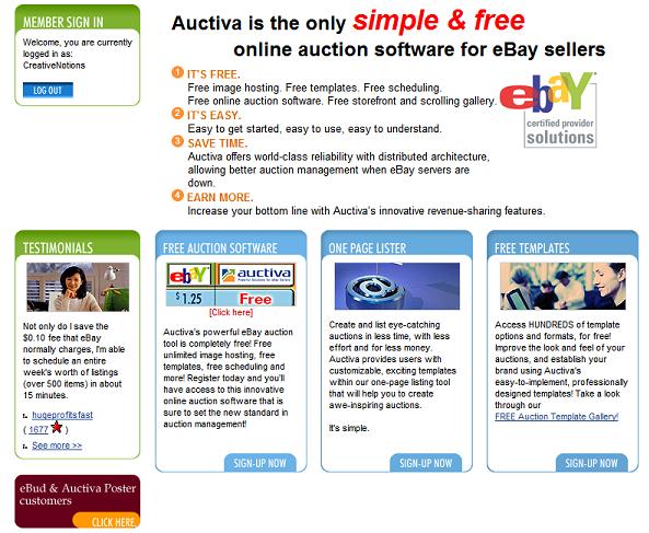
Does anybody pay any attention to the Auctiva home page when you log in? I know I sure don't. Let's take a look at it:


It's the same old boring sales-pitch-type stuff that's been there for years. Why try to sell Auctiva to us, when we're already using it?

Why not give the users something a little more informative for their home page. Why should users have to log into the forums to get the "News" and other important issues affecting the site? Why not just post them as entries on the home page? When you log into MyEbay, one of the first things you see is announcements, right? I, for one, think it's one of the few things that eBay does right. I think you'd get less complaints from people when there are issues going on with the site. After all, what percentage of Auctiva's users actually visit the community forums.

Maybe I'm off base here, but I, for one, would appreciate a home page that has some useful content.
Original Post

Replies sorted oldest to newest

quote:
Originally posted by kbalona:
Don't forget though, even though you might have been using Auctiva for years now, every day there's new people that visit Auctiva that don't know what it's all about.


True enough. I'd still support a strong 'new user' info layout, just move things around, resize, add new content as well.

Not that it should be a priority, we all know they are doing a ton of work in the background making sure things run smoothly. Still, it would be a great thing. IMPO Smile

Best regards,
quote:
Originally posted by kbalona:
Don't forget though, even though you might have been using Auctiva for years now, every day there's new people that visit Auctiva that don't know what it's all about.


True, but is there any rule that the logged-in home screen for members has to be the same as the landing page for non-members just visiting the site?

Add Reply

Copyright © 1999-2018 Auctiva.com. All rights reserved.
×
×
×
×
Link copied to your clipboard.
×